Office 365 Adoption Content Pack for Power BI Coming Soon
Update May 22: Microsoft has put the content pack into public preview. The big news is that this update allows for a daily data refresh. See this documentation to implement the content pack for your tenant.
Power BI Casts a Light Onto Office 365
At the September 2016 Ignite conference, Microsoft began talking about a Power BI content pack designed to help Office 365 tenants gain insight into how engaged their users are with the various applications in the suite. You can view the Ignite session discussing the content pack as well as the blog announcement online.
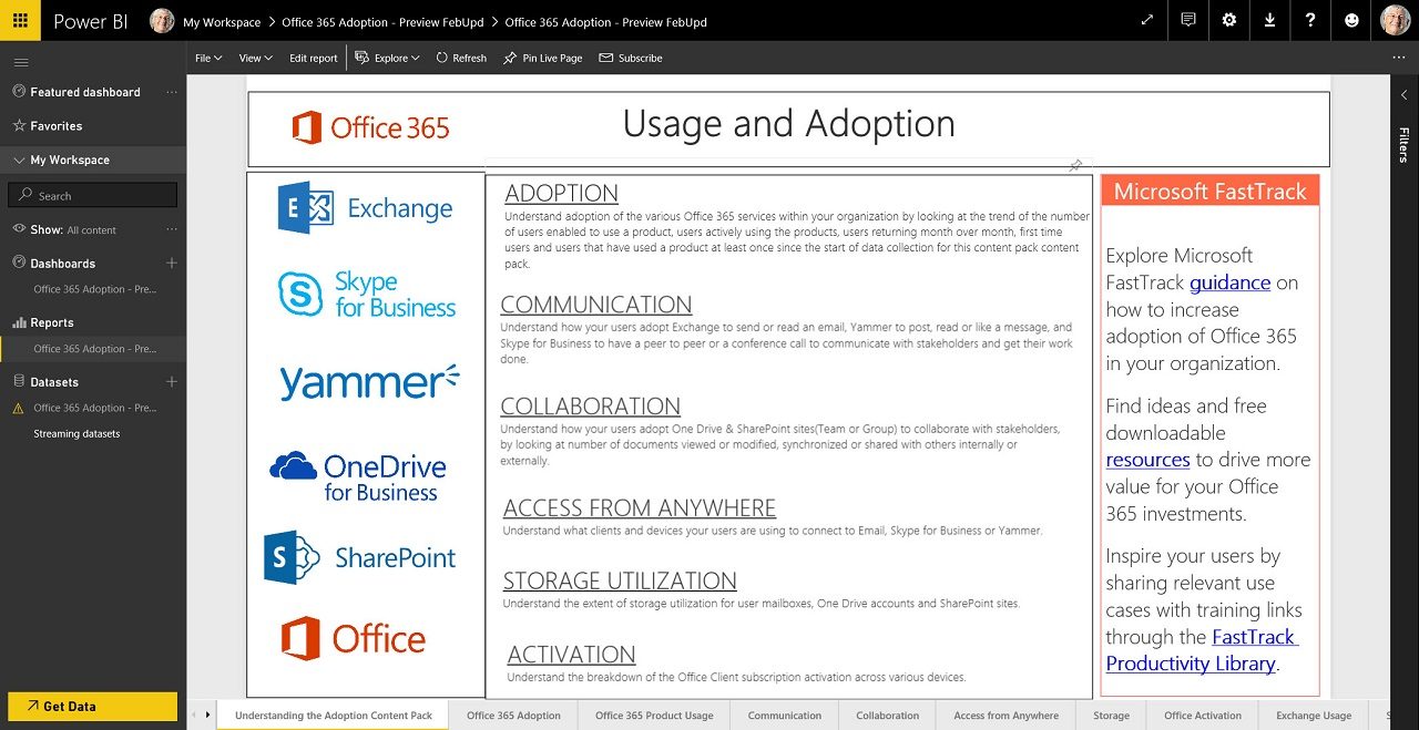
Now, after several months of preview, the Office 365 Adoption Content Pack is almost ready for launch. A content pack is a collection of pre-packaged graphs and charts that can be loaded into Power BI, so this pack contains lots of graphs based on Office 365 data that collectively provide a dashboard for a tenant. The dashboard offers four overviews:
- Adoption: Tracks the usage of Office 365 and basic workloads like Exchange and SharePoint.
- Communication: Tracks how people use email, Skype (meetings), and Yammer to communicate.
- Collaboration: Tracks how people use SharePoint and OneDrive for Business.
- Activation: Tracks the activation of Office 365 ProPlus, Project, and Visio licenses.
The content pack works with the free version of Power BI. The content pack will be available free of charge to all Office 365 enterprise tenants.
Product Usage
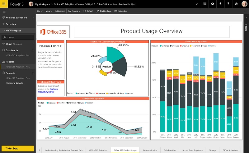
The content pack offers several useful overviews of usage for Exchange, OneDrive for Business, SharePoint, Skype for Business, and Yammer. The Product Usage Overview graph (Figure 1) delivers a snapshot of the use of the products available within Office 365. As always, graphs display some interesting data points to debate. For instance, 81.82% of people having accounts in the tenant use Office 365, but 81.25% use Exchange. How many people use other parts of Office 365 and never go near Exchange?
As it happens, the content pack has an answer to this question because you can go to the User Adoption by Product tab and look at the Active/Inactive Users by Product report. There we find information such as which users are active in specific products or groups of products – or are not using Office 365 much at all.
Mastering Trends
Another use of the dashboard is to look at usage trends, such as whether email traffic increases over time. It can also help you to understand changes in user behavior. For instance, if you make a determined effort to convince people to store documents in SharePoint and OneDrive and access the files there rather than attaching them to email for circulation within the company, a steady uptick in file storage should result. If it does not, then the campaign is unsuccessful and you might need to take a different approach to convince people to use “cloudy attachments”.
Another example is in Skype for Business, where a reduction in email traffic should match an increase in minutes consumed in instant messaging and conversations. That is, if people have changed their behavior.
Drilling Down
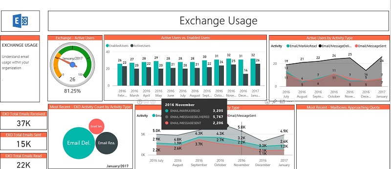
You can drill into each product to understand its activity better. For example, the Exchange usage chart gives data about total email activity, the numbers of mailbox creations, and email activity over time. By looking at the Exchange data, I could see that numbers of inbound messages to my tenant fell off after the introduction of the Focused Inbox (Figure 2) from October 2016. Messages that end up in the Other view are probably unimportant and that realization can lead people to unsubscribe from mailing lists. This example shows the importance of understanding all the moving parts to make sense of a data point. After all, if I had added several new users around the same time, their email activity might have cloaked the effect of the Focused Inbox.
The dashboard also seeks to identify trends, such as whether email traffic increases over time. It can also help you to understand changes in user behavior. For instance, if you make a determined effort to convince people to store documents in SharePoint and OneDrive and access the files there rather than attaching them to email for circulation within the company, a steady uptick in file storage should result. If it does not, then the campaign is unsuccessful and a different approach might be needed. Another example is in Skype for Business, where an increase in minutes consumed in instant messaging and conversations might be accompanied by a reduction in email traffic.
All About Adoption
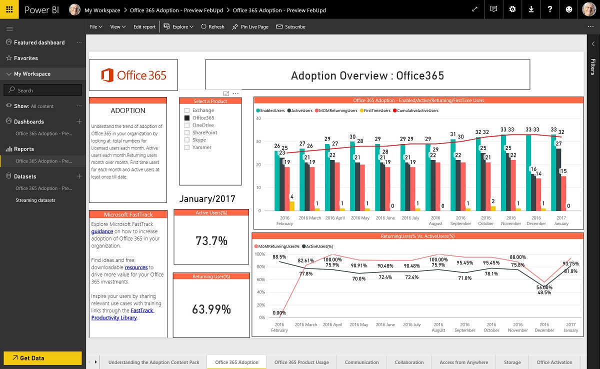
As the name implies, the intent behind the content pack is to help Office 365 tenants make better use of their investment in the suite. Many companies buy Office 365 and focus on a single application, like Exchange Online or SharePoint Online, and forget that they can extract more potential value from applications like OneDrive for Business. The content pack aims to help tenant administrators to understand the adoption rate and usage for various aspects of Office 365 over the last 12 months (Figure 3).
There’s no magic here because any competent administrator can figure out the usage patterns within an Office 365 tenant by using the reports that are available in the Office 365 Admin Center and some observations of their own. After all, if your company is not interested in Yammer, then it should come as no surprise that Yammer activation and usage are low. On the other hand, if you’re in the middle of transitioning email workload from on-premises servers, then you’ll be all too aware of how many mailboxes are in Exchange Online and you’ll have a reasonable idea of the traffic patterns.
Everyone loves a graph. Yet hardly anyone is precise and persistent enough to go and get the data necessary to build graphs over a sustained period. This is where the value of the content pack arises because Microsoft takes care of assembling the data and presenting it in an accessible manner through a collection of Power BI charts and graphs. The same basic data appears in the reports available in the Office 365 Admin Center, but the content pack makes that data easier to understand and work with.
The Underlying Data
All the charts presented in the content pack are a point in time snapshot. To build the charts, Microsoft uses usage data drawn from across Office 365. It takes a couple of days to ingest, normalize, and process the data from the various workloads before the month to date charts ae updated. That’s totally understandable because the scale of Office 365 makes it enormously difficult to have data appear sooner. Month over month comparisons are available at the end of each month.
You can’t drill down into the fine detail of the data that lies behind the figures. One reason is Microsoft only keeps summary data about usage past the last six months – any data past this point is pre-aggregated and static. Another is that an integration between the content pack and the underlying data sources doesn’t exist, so you can’t click through to explore where the charted data originates.
But It’s All About Adoption
Free stuff often comes with a downside. The downside here is that the content pack is all about adoption. Microsoft wants you to use more of Office 365 – all of Office 365 – so the content pack focuses on encouraging tenants to get to 100% usage of the applications Microsoft has chosen to include in the pack: Exchange, OneDrive for Business, SharePoint, Skype for Business, and Yammer.
You can quibble about how the dashboard categorizes Office 365 activity. For instance, I’d argue that collaboration does not mean sharing of documents through SharePoint and OneDrive as measured here. Email still is the primary collaboration mechanism for many people. That might begin to change with the advent of Teams if people start to chat instead of sending messages – if that happens, then this content pack should reveal a decline in message volume over time.
Communication covers the use of Exchange, Skype, and Yammer. I expected to see Teams here because it is a much more strategic communication vehicle for Office 365 than Yammer ever was and is today.
A Limited Dashboard?
The dashboard excludes the use of other Office 365 components such as Planner, Delve, StaffHub, Office 365 Video, and Sway. In effect, this dashboard covers the use of three fundamental workloads and one that is of interest to a small percentage of the overall Office 365 population. Although I hope they do, Microsoft is not saying whether they will expand the dashboard to deliver coverage of other activities. In any case, the categories are what they are and you can’t change them.
On the other hand, the potential already exists for those who know Power BI to customize and organize the dashboard to make better use of the underlying data. You can create different views and change reports in the current content pack to better suit your needs. Another project that I think some will take on is to integrate the Office 365 information with other IT data for a company to create an overarching dashboard for IT operations.
From one perspective, the current choice for application coverage is very understandable as Exchange, SharePoint, and Skype for Business are the base workloads that run inside Office 365. Yet the disappointing aspect of the content pack is the way that it ignores some parts of Office 365 that might drive usage (like Office 365 Groups or Office 365 Video) and has no knowledge of others at all (like Planner and Teams).
It’s understandable that Teams and Planner do not feature in the content pack. Teams is, after all, just become generally available – but Planner has been available since June 2016. I suspect that the reason is because these applications do not feed the same rich set of usage signals to Office Graph that are available for the other workloads. You can’t report about the usage of an application if the data isn’t available.
Microsoft gathers data from across Office 365 to aggregate and refine the data monthly to refresh the dashboard. Given the scale of Office 365 and the amount of data to be processed, this approach is understandable, but it does mean that the dashboard reflects a static view of a tenant rather than what is happening now.
In short, this version of the content pack delivers a limited but useful view of the Office 365 landscape. You’ll be happy if you’re concerned about what the dashboard covers but frustrated if you want to know about other aspects of the service.
The Directory Is Important
One thing is for sure, if you want to use the content pack to analyze usage across a tenant, you must pay attention to the company, region, and department attributes held for user accounts in Azure Active Directory. The content pack extracts and uses these values to filter information and if they are incorrect (or blank), you might not be able to view data quite the way that you want. If you’re not quite as good as you should be at keeping directory information consistent and complete, you might want to check out a product like Hyperfish.
The Future
For now, Microsoft makes the content pack available “as is”. In the future, Microsoft plans to make the Power BI template file used by the content pack available to allow Power BI gurus to manipulate it using the Power BI desktop.
Microsoft is listening to the feedback from the many tenants who used the content pack during the preview. That feedback tells Microsoft that that coverage of the complete picture within Office 365 is desirable. Although no public commitment exists, background channels say that coverage of Office 365 Groups will come soon and that the content pack will evolve to incorporate data from other workloads as time and development resources allow.
Another update that’s due to come is the provision of a Reporting Administrator role that tenants can assign to accounts to allow people to use the content pack and view Office 365 reports without needing to be a tenant administrator. You can already share the data in the dashboard through Power BI and that is probably enough for some.
Also in the works is an API to allow tenants and ISVs access to the aggregated data used by the content pack. This API is in preview and enables tenants to develop their own dashboards. ISVs can use the API to incorporate the data into existing reporting solutions. Let’s hope that the API is more reliable than has proven for some current Office 365 APIs.
One Step Forward
The current iteration of the Office 365 Adoption Content Pack is a flawed and imperfect offering. Even so, there’s lots to like about it, especially that it will be available to all tenants. Microsoft will improve and refine the content pack in the future to add coverage of more workloads. Overall, this is a welcome step in the right direction.
Follow Tony on Twitter @12Knocksinna.Want to know more about how to manage Office 365? Find what you need to know in “Office 365 for IT Pros”, the most comprehensive eBook covering all aspects of Office 365. Available in PDF and EPUB formats (suitable for iBooks) or for Amazon Kindle.


