You have heard the buzz that Power BI is awesome. You have also heard that it is the future of all things Microsoft BI but you are a SharePoint person. Therefore, you do not really care about all of the bells and whistles. You want to see and understand how Power BI interacts with SharePoint Online lists to build cool reports. You want to see how to turn around and display those reports on your SharePoint site. Makes sense. You want to know what is in this thing for you. Good news! This two-part article is all about that. We are going to look at going from nothing to a kick-butt data visualization using your friend and mine, SharePoint.
In part one, we will walk through installing Power BI Desktop, connecting to your SharePoint Data, and building a cool visualization. In part two, we will handle publishing Reports online, configuring SharePoint data refreshes, and adding the report to your SharePoint site using the Power BI Web Part. Very exciting.
First, there is one thing we need to get out of the way. To use the SharePoint Online Power BI web part, you and all of your users must have a Power BI Pro license. I barely understand what that means. If you have any questions, I recommend consulting a licensing specialist. There is a trial available where you can get more information.
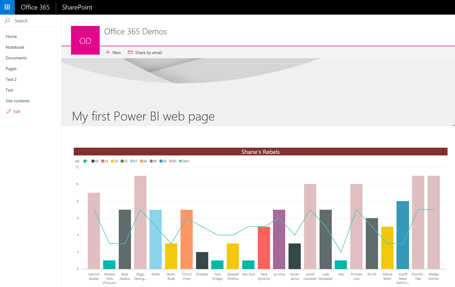
Let’s build something like this together. It is super quick! At the end, I will also share with you a video version of this article. For some, hearing me is easier than reading me.
We are going to break this down into six, reusable steps. Hopefully, this will make it easier for you to reference this article later. Remember, browser bookmarks are your friend. Go ahead. I will wait.
- Install Power BI Desktop and create a Power BI account.
- Connect to and format your SharePoint List Data.
- Create your first visual with SharePoint List Data.
- Save and Publish your report.
- Enable Adjust your refresh settings for SharePoint List Data.
- Create a SharePoint Modern Page. Use the Power BI Viewer (Preview) web part and make magic.
Install Power BI Desktop
Power BI Desktop is the application you can install locally on your PC. This is how to locally build all of the magic. I never enjoy building anything in the browser, so even though all of the functionality is there, I still install the client. Call me old school.
To download the client, head over to the Power BI Desktop website and click the big download button. When it finishes downloading, it is pretty much next, next, and finish. I will not bore you with that part.
When the install finishes, launch the app. The first step is to sign into Power BI. If you do not already have an account, you can create one for free. Remember that when you are signing up, you need a Pro license for the SharePoint part to work.
Create a Quick SharePoint List
If you already had a list you wanted to use, this is not a step you would do. If you do not have any data, here is the list I am using.
- List Template = Custom List
- List Title = Power BI is Fun
- Add three number columns = Age, Weight, Ideal Weight
- Fill in some dummy data of approximately 5 people. Use your friends and be mean. To make the report look cool later, make sure at least a couple of people have the same age. If you want to be nice to your friends, everyone over 30 likes to be 29.
Connect to SharePoint
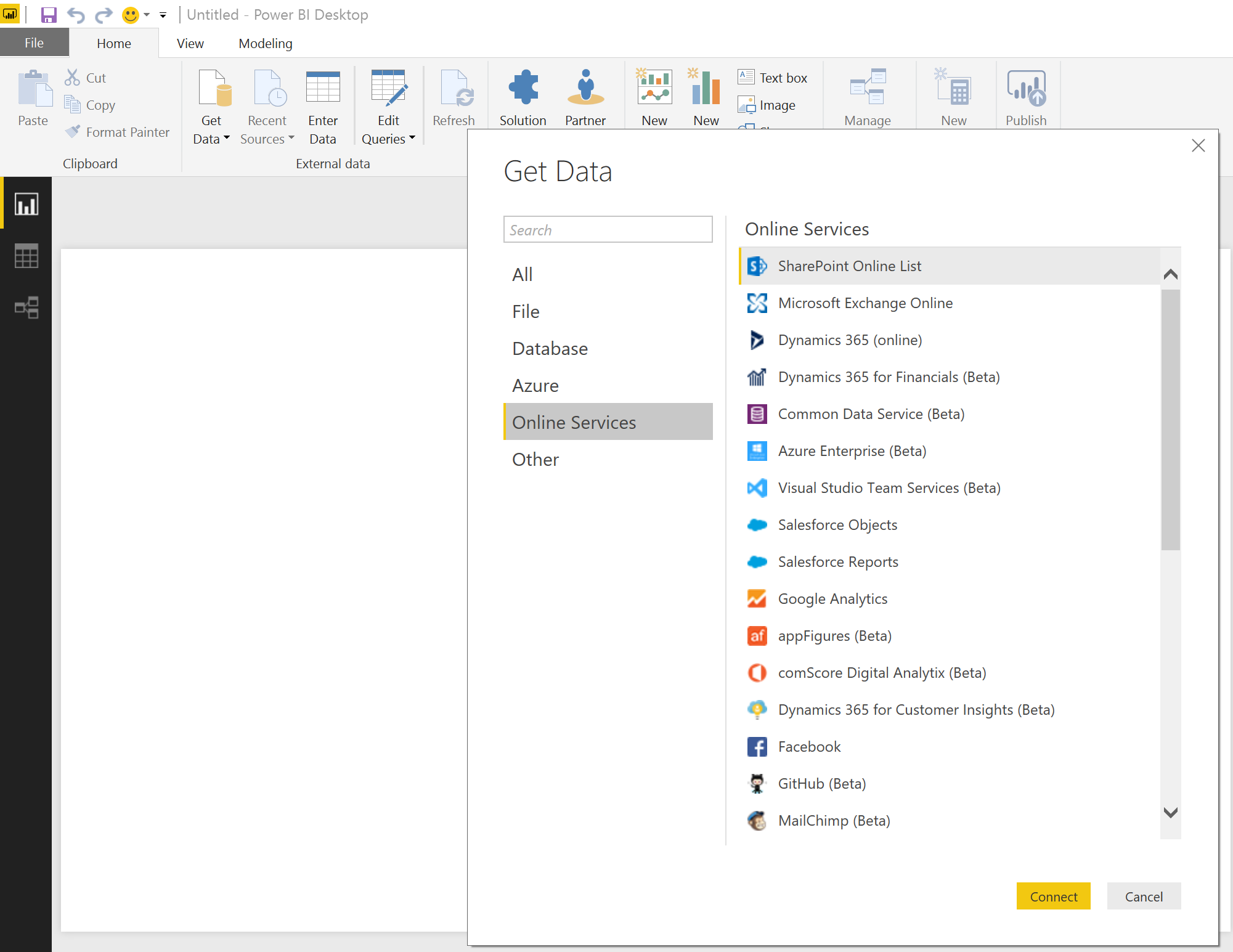
Now that you have Power BI Desktop opened, you want to click on Get Data from the ribbon. From the left-hand menu, click on Online Services, select SharePoint Online List, and click Connect. The screenshot below should help.
You will be prompted for the URL. Enter the URL for your SharePoint site. You can browse for the list you want to connect to. You will be prompted for authentication. Depending on if you are working with SharePoint on-premises or online, your choice may be different.
- On-premises = Windows most of the time
- Online = Organizational account most of the time
Once you choose the correct option and get authenticated, you should not have to mess with this going forward. This first time through, there are a ton of passwords. UGH. With the password business all done, click Connect.
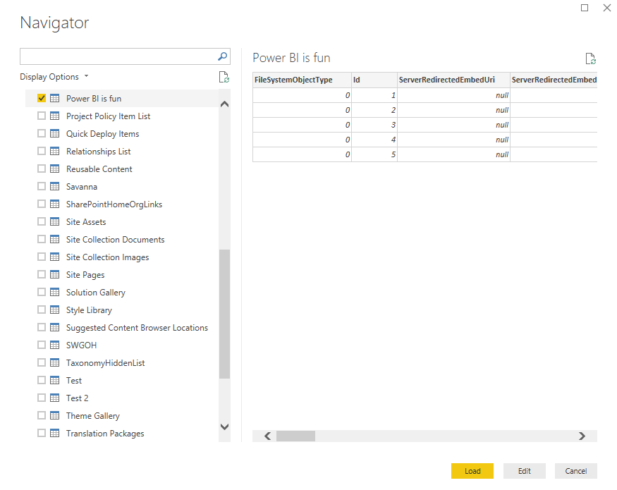
This will open the Navigator. You can select your list and click Load.
That is it. You are connected to SharePoint and can have fun. What? Not enough? Fine, we can keep going.
Now that you have connected to your SharePoint list, Power BI has brought in EVERYTHING. The 30 or more columns of information are overkill. All you want is the columns with real data, so let’s get rid of the rest to make this easier to use.
To get rid of the noise, click on Edit Queries from the ribbon. This will open a new window for the Query Editor. In the ribbon, click on Choose Columns. Now, you can select only the columns you actually want. For this example, I selected Title, Age, Weight, and Ideal Weight. Click OK.
That is much better. Now, you can worry about the data you need. The other thing you will want to do is update the column type. For example, even though we made Age a number column in SharePoint, it was imported as a Any data type. That limits what you can do with the data later, so you need to change the column types of all of your number columns to a number in Power BI. To do so, click on the Age column. From the ribbon, click on the drop-down for Data Type: Any. Select the appropriate type of number for your column. Decimal works well.
Repeat that process for the Weight and Ideal Weight columns. Once you are done, click Close and Apply.
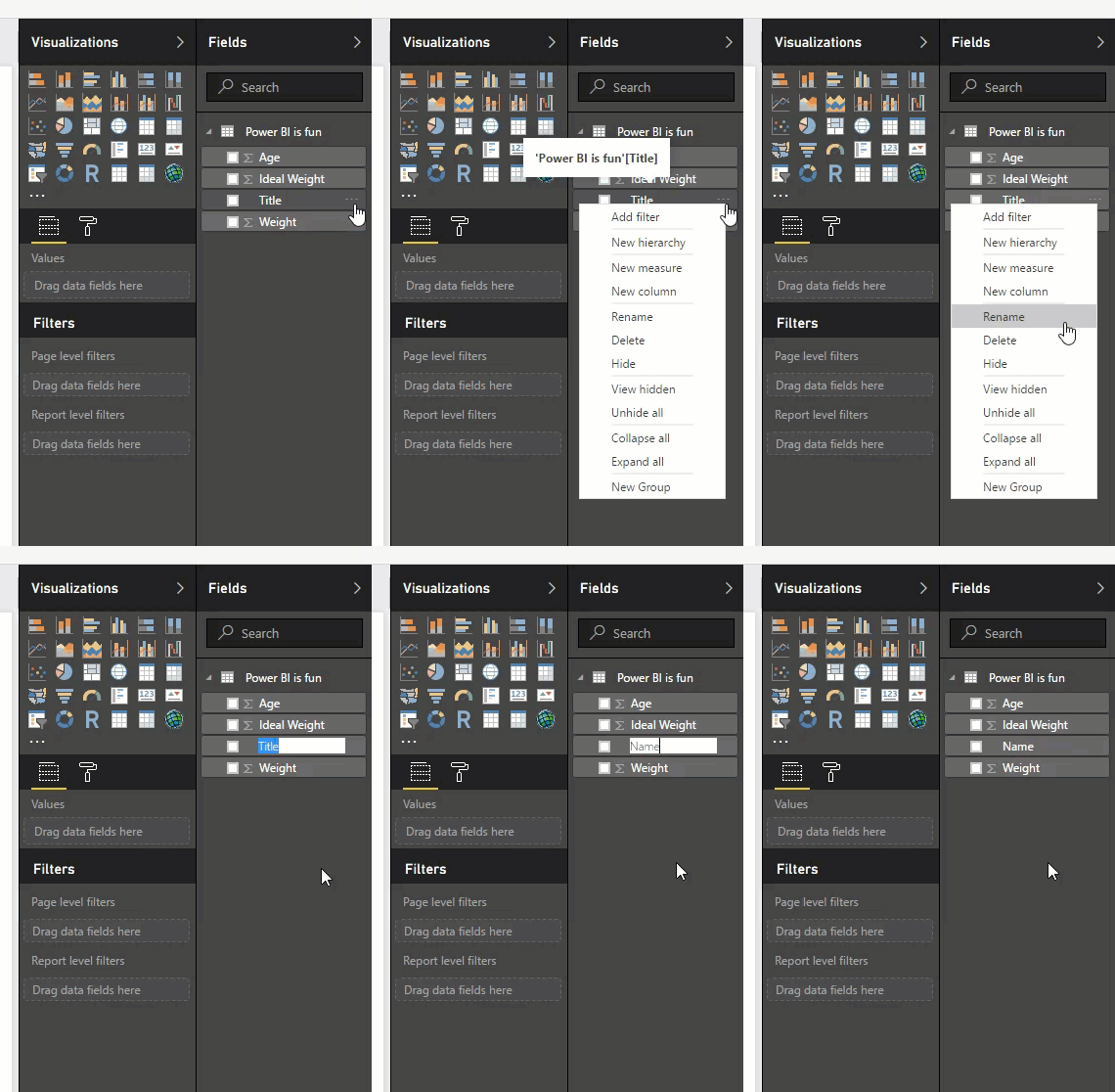
This brings you back to your original Power BI desktop window. There is one more quick, clean-up step. The column Title is kind of weird and should probably be called Name or something similar. Turns out that even if you go back to your SharePoint list and rename the column, it will not matter. Power BI will still call it Title. Boo! The good news is that you can rename the column in Power BI. Yay! To do so, hover over Title on the right. Click the ellipses and from the drop-down, select rename. Much better.
Now, you can build better visuals without all of the chaos of too much or bad data. How exciting.
Create Your First Power BI Visual
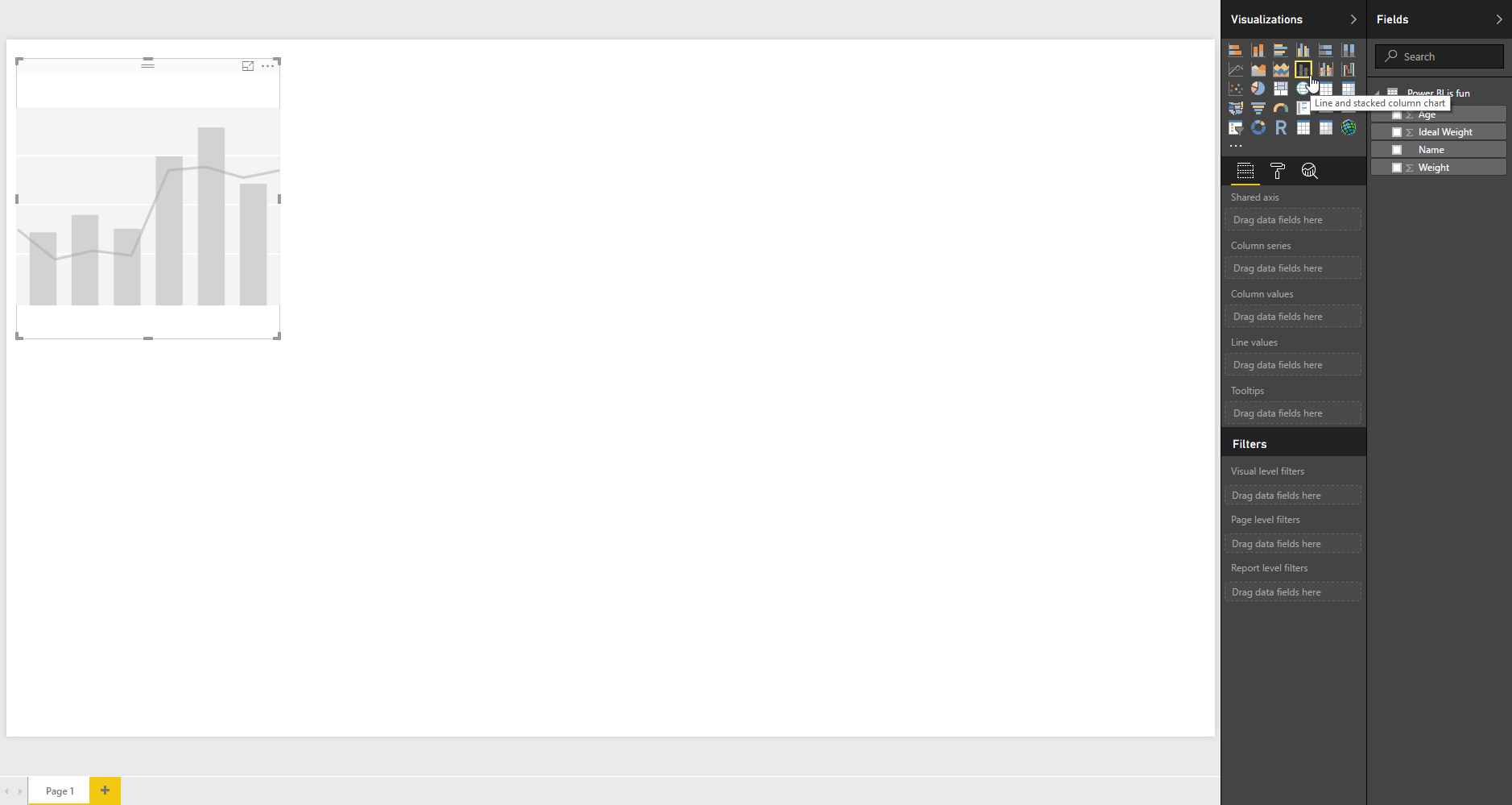
Let’s take that beautiful blank canvas and turn it into an even better looking colorful chart. There are many visualizations for you to explore but for this example, we will use the Line and stacked column chart. I understand that one. To add it to your design pane, click on the link on the right.
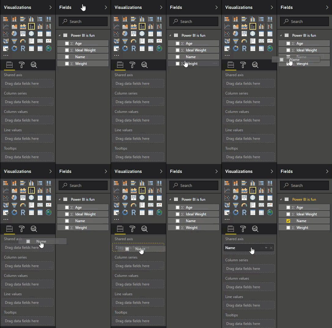
That was easy. Now, you can drag the different columns to the right location in the interface. Let’s work through each so that it makes sense. Even though it means more typing for me, the things I do for you people.
Drag Name to shared axis. That makes sense since we want to view the various stats of each person by their name. Your visualization does not do anything yet.
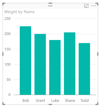
Drag Weight to Column values. If you wait one second, the visualization will update. You will soon see your data. Not earth shattering but tangible progress has been made.
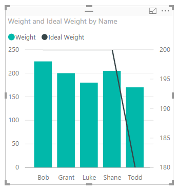
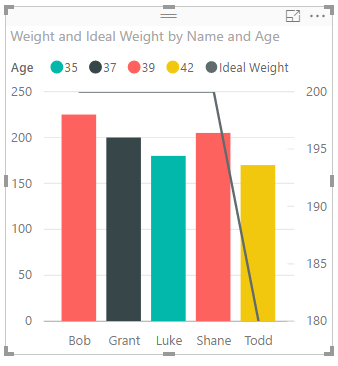
Drag Ideal Weight to Line values. The visualization updates but probably does not look very good. Do not worry. We will fix that.
Finally, drag Age to Column series. That is pretty cool if you have people with the same age. It gives that wonderful rainbow effect that makes pointy-haired managers swoon.
Now, you have all of the data in the correct place. Let’s look at the options to make it more appealing.
The first step is to fix the scale of the two Y-axis. To do that, you click on the paintbrush symbol above Shared axis. Now, the world is your oyster. They have made formatting about as easy as you could have hoped for.
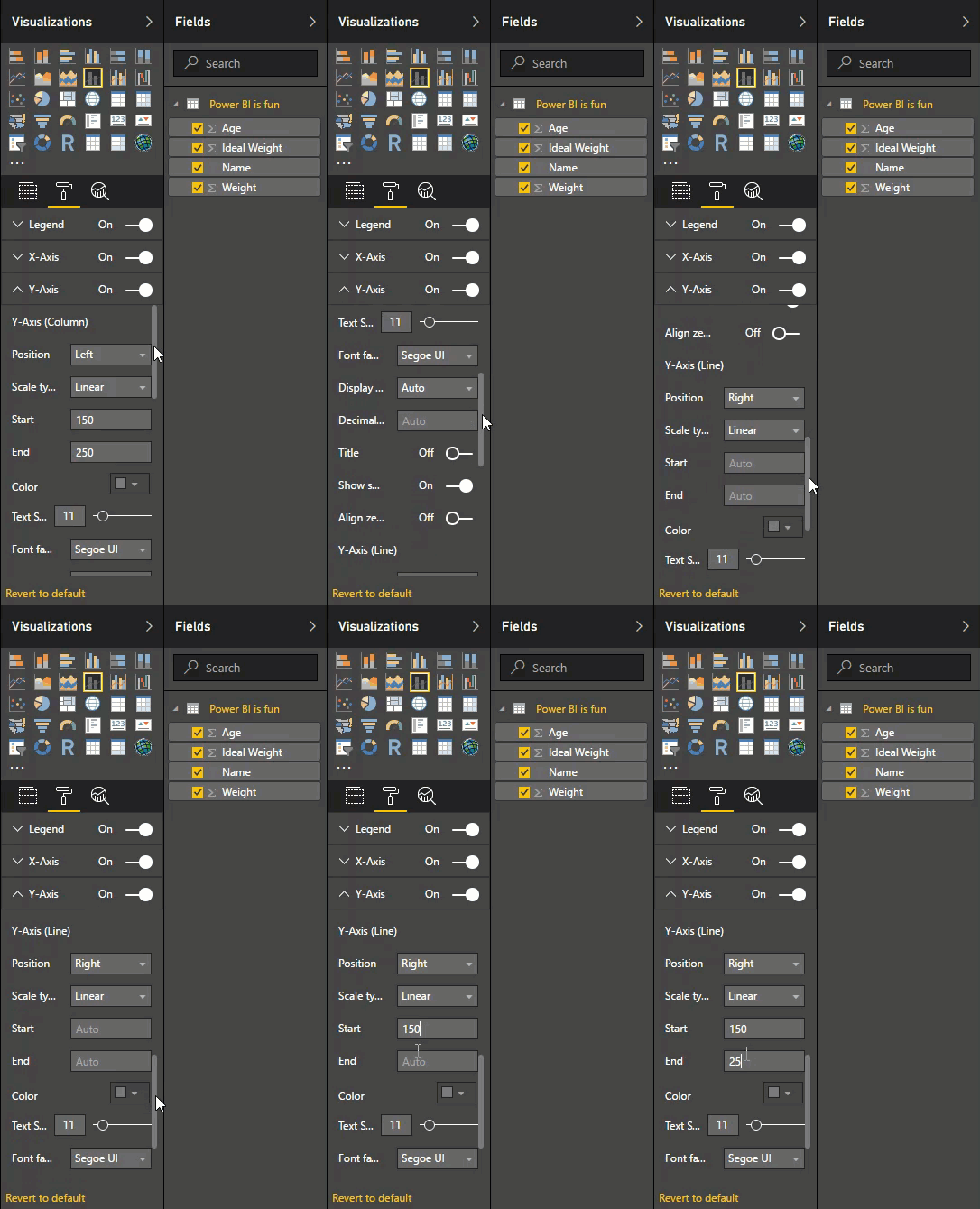
Expand the Y-Axis section by clicking the drop-down arrow. The first option adjusts the Y-Axis for the column values that are on the left by default. For Start, change the value from auto to something that works better for you. Based on my data, I will change mine to 150. Then, change End to a bigger number. For me, that is 250.
Here is the tricky part. To access the Y-Axis (Line) section, you have to slide the scroll bar down. This took me about a month to figure out, so hopefully, you will find it faster. Watch my fancy gif to see it in action.
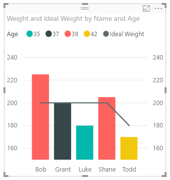
Set the Start and End values. Because I like consistency, I also used 150 and 250, respectively. You should have something that is looking pretty nice at this point.
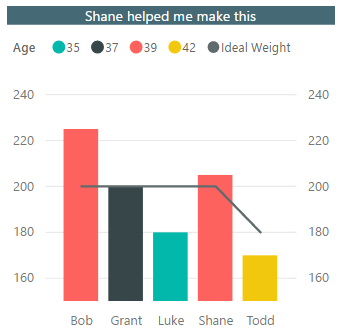
To make things look even nicer, let’s adjust the Title. In the same pane, expand Title. From here, you can edit the text and do some formatting. With a little work, I came up with the picture below.
I edited the text, the font, and background color. I also clicked on center alignment because I do not like left justified. You could also grab the edges of the visualization and resize it. You can make it bigger or maybe you have so many friends, unlike me, that you need more room horizontally. Power BI is quite accommodating.
You should save all of this work. It works the same way every other Microsoft program does, so I refuse to explain how to do it. You can also save it wherever you want. You can save it on SharePoint or your desktop. In the next step, we will publish all of this hard work online. That is the part that counts.
That Is Enough for Today
I do not know about you, but I am tired. I am going to stop here for the day and take a nap. We had a good day. We went from nothing to a pretty awesome visualization of SharePoint data using Power BI. In the next article, Getting Started with Power BI and SharePoint Online — Part 2, we will publish that visualization. Then, we will display it back in SharePoint using the Power BI web part. I know I am excited. If reading is hard for you, then you can watch me do all of this same stuff on my YouTube channel: Getting Started with Power BI and SharePoint Online Video.


