Microsoft Azure and Intune Management Portal Gets A Makeover
Microsoft frequently updates the Azure management portal with small changes to improve the user experience. But recently, there was a more major update that dramatically changes the portal’s look and feel. Instead of seeing the dashboard and portal menu expanded as the default experience when you open the portal, now you have the option to see a list of services – or ‘home’ as Microsoft refers to it – with the portal menu docked.
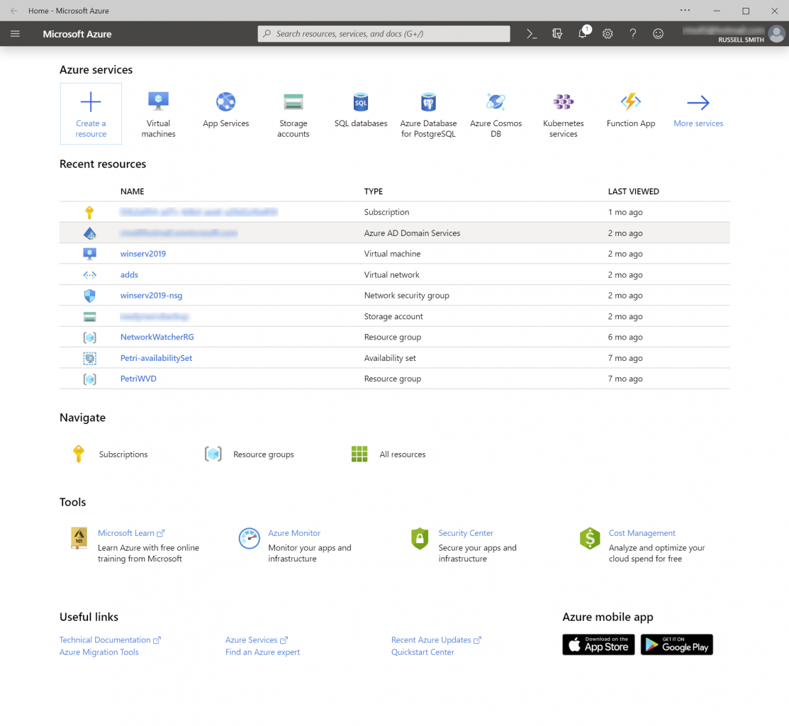
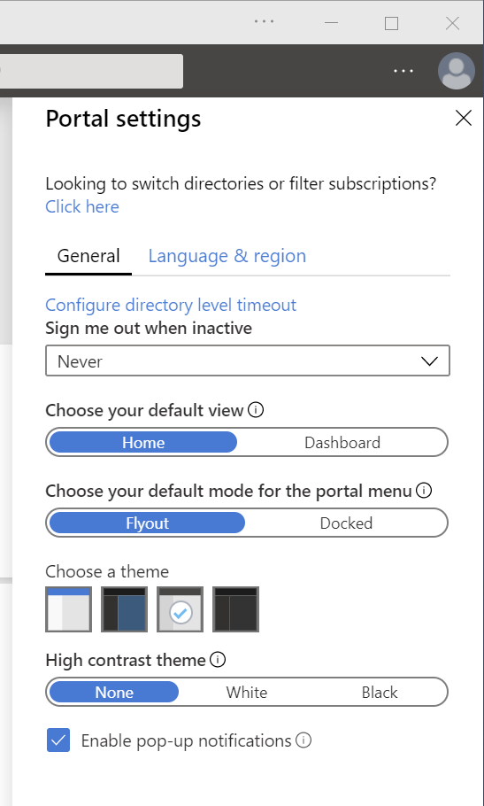
The home screen lets you add and search for resources and services, it lists resources that you’ve recently accessed, and it provides links to tools, resource groups, and subscriptions. The portal menu can be accessed using the hamburger menu in the top-left of the management portal window, where you can also switch to your dashboard. You can revert to the old-style portal by changing the Choose your default view and Choose your default mode for the portal menu options in the Settings panel, which is accessible from the dropdown menu in the top-right of the Azure portal window.
Not everyone is a fan of Microsoft’s Azure management portal. But regardless of whether you like the configuration panels, these changes are welcome because dashboards are only useful if you customize them. Often, they look an unholy mess without some care and attention, and they aren’t always what you want to see as the default view when opening the management portal. But the new home screen presents a clean view from which you can quickly add or manage existing resources, without any unnecessary clutter.
Intune Gets Improved and Streamlined Administration Experience
Microsoft’s Mobile Device Management (MDM) service, Intune, hasn’t been left out either. As part of work to deliver a simplified management experience for Microsoft 365 customers, the Intune portal gets simplified navigation and new platform filters. The new admin experience is accessible using the dedicated Intune portal at https://devicemanagement.microsoft.com The Intune experience available as part of the Azure management portal remains unchanged.
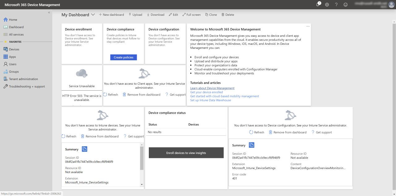
The Intune redesign also has a new homepage where you can quickly see service health, the state of your tenant, and information about new features. It is designed to help administrators respond faster to alerts and issues before they escalate into major helpdesk events. There’s also a simplified first level of navigation with more logical grouping of functionality. And the previous long list of menu items has been replaced by the hierarchy of elements that admins have to deal with for endpoint management.
Platform Filters
Microsoft has also added the ability to filter by a single platform so that admins can complete configuration and monitoring tasks for a platform instead of having to perform each step for all platforms before moving to the next task. You can filter by platforms like Windows, iOS, Android, or macOS.

