


Yammer Previews Fluent User Interface
Year of Yammer Keeps on Rolling
Seven months after Microsoft declared the “Year of Yammer,” a public preview of a much-hyped (at Ignite 2019) new user interface is available to Office 365 tenants. General availability of the new Yammer is expected in July 2020. The new interface is already available in the Yammer mobile app and leverages the Fluent Design system to create what Microsoft says is a “beautiful, intelligent user experience across devices.”
Before going into the details of the preview, I’d like to thank Murali Sitaram, GM of Yammer, for resisting the temptation to refer to “superpower” in his post. For those who don’t know, software doesn’t have superpowers, not even if you work in marketing.
New Features
Apart from the general usability and appearance of the new interface, among the features highlighted by Microsoft in the preview are:
- Community owners can add a cover photo to highlight the purpose of the community (Microsoft announced that they would rename Yammer groups as communities at Ignite 2019 and made the change in February).
- Users can report conversations to community owners (like Facebook).
- Users can mark communities as favorites to have them appear at the top of the communities list.
- A new editor and sharing options. You can browse your device to find files to share (uploaded to SharePoint Online), but you can’t browse SharePoint Online or OneDrive for Business libraries unless they’re synchronized to your workstation.
- Microsoft Search appears in the browser bar.
- The user profile card looks like those found in other Office 365 applications.
Not wanting to miss an opportunity to remind people about previous Yammer announcements, Microsoft also throws in the ability to respond to Yammer conversations in OWA (from February) and the Yammer app for Teams (April). If you switch to the new interface, it shows up in the Teams app.
Enabling the Preview
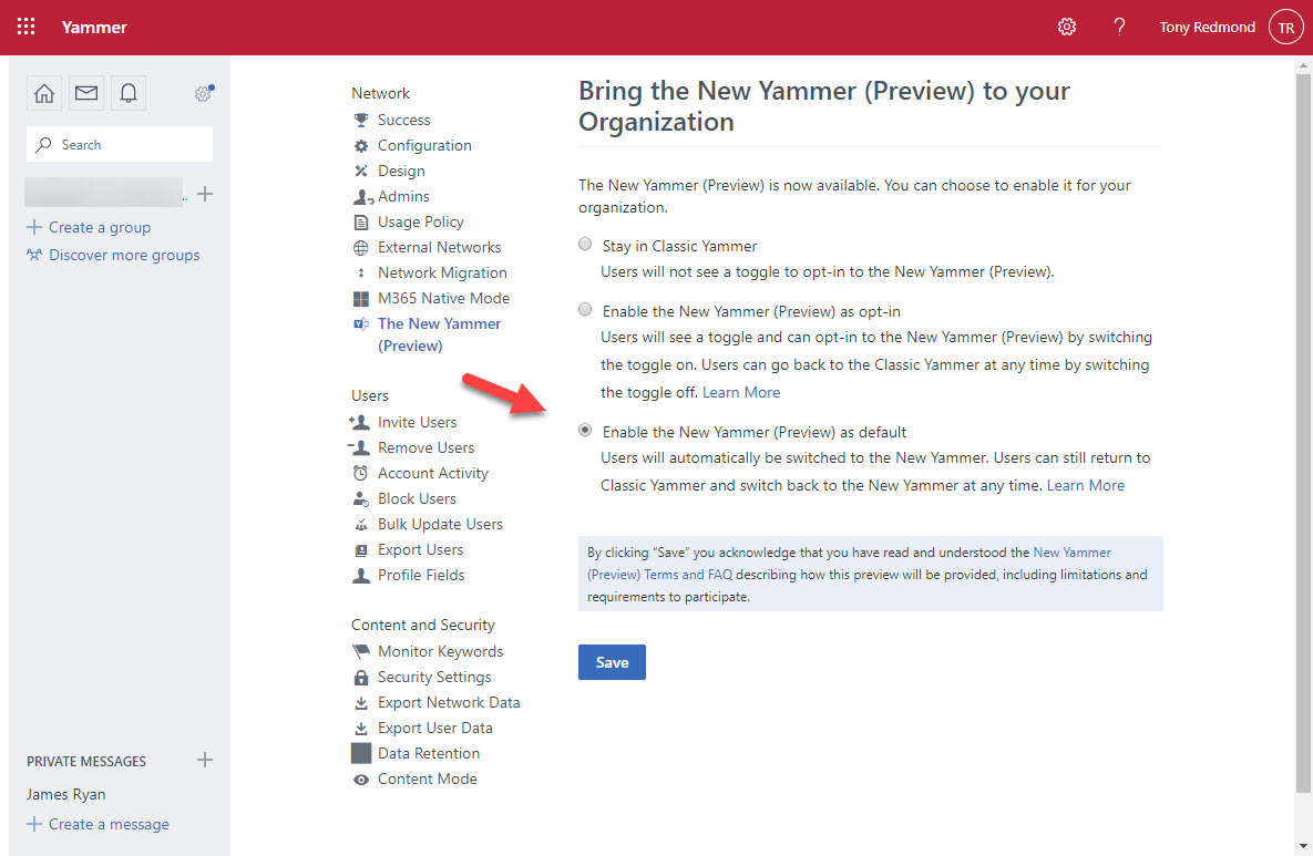
Enabling the new user interface is a matter of going to Yammer admin and choosing “The new Yammer (Preview).” You then see a screen to select if you want users to have an opt-in switch or will automatically switch everyone in the tenant to the new interface (Figure 1).
It’s important to realize that the new interface is unfinished (which is what a preview is all about). Microsoft’s FAQ has more details about what’s available and what’s not, with the plan being that this is a living document.
The New Yammer Interface
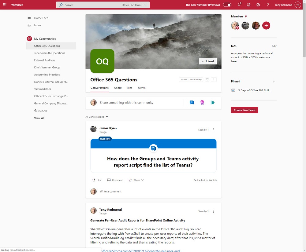
Figure 2 shows the new layout, complete with a custom photo for a community. Microsoft Search is visible in the browser bar. The layout is clean and attractive, although some might question the amount of white space (not that I am a graphic designer).
Access to Community Resources
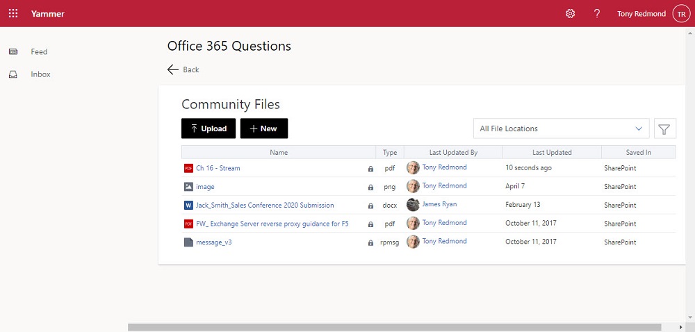
Modern Yammer communities use Microsoft 365 groups to manage their membership. The old Yammer interface includes links to Office 365 resources belonging to group (SharePoint, Planner, and OneNote). The new interface doesn’t show the same links and you must navigate to the About section to find them. Also available is a new Files link to bring you to a screen listing files belonging to the community (Figure 3). It’s a curious screen that appears to have little connection to the rest of the fluid interface.
Problems with Yammer Files Data
The data used to create view doesn’t seem to come from SharePoint. Poking around in the group mailbox for the community, it seems like the data is stored in a hidden folder called AllFiles. Some form of synchronization must exist to make SharePoint information available to Yammer, but updates are not immediate or even close. Files uploaded through Yammer appear in the view and are in SharePoint, but files uploaded to SharePoint or other changes made there don’t appear. Waiting for a few minutes for updates to show up might be acceptable; waiting for hours isn’t (some changes I made 24 hours ago are still invisible).
Clicking a file invokes a viewer instead of bringing you to SharePoint to access the file. You can choose to edit the file using an online or desktop app or download a copy. Oddly, if you delete a file, Yammer tells you that the action cannot be undone when this is obviously possible using the SharePoint recycle bin. To be fair to Yammer, the message might mean that the delete can’t be reversed through the Yammer Files interface.
I realize that some older networks still have files stored in Yammer and Microsoft wants to make files associated with a community more accessible, but this implementation is odd. For Yammer communities connected to Microsoft 365 Groups, it would be cleaner to have Yammer link direct to SharePoint Online and let SharePoint manage files instead of Yammer attempting to recreate a wheel (badly).
The Unwanted Yammer Sign-in Syndrome
My tenant’s Yammer network is configured in Microsoft 365 native mode. This mode is supposed to make the best of Microsoft 365 available to Yammer. My experience is that native mode makes Yammer sign-in frequently, which is a very different experience to Yammer configured in other modes or any other Office 365 application. SharePoint Online doesn’t prompt for credentials on an ongoing basis, nor does OneDrive for Business, or Planner, or Teams, or OWA. But Yammer does for accounts secured with and without MFA, and it’s a real pain.
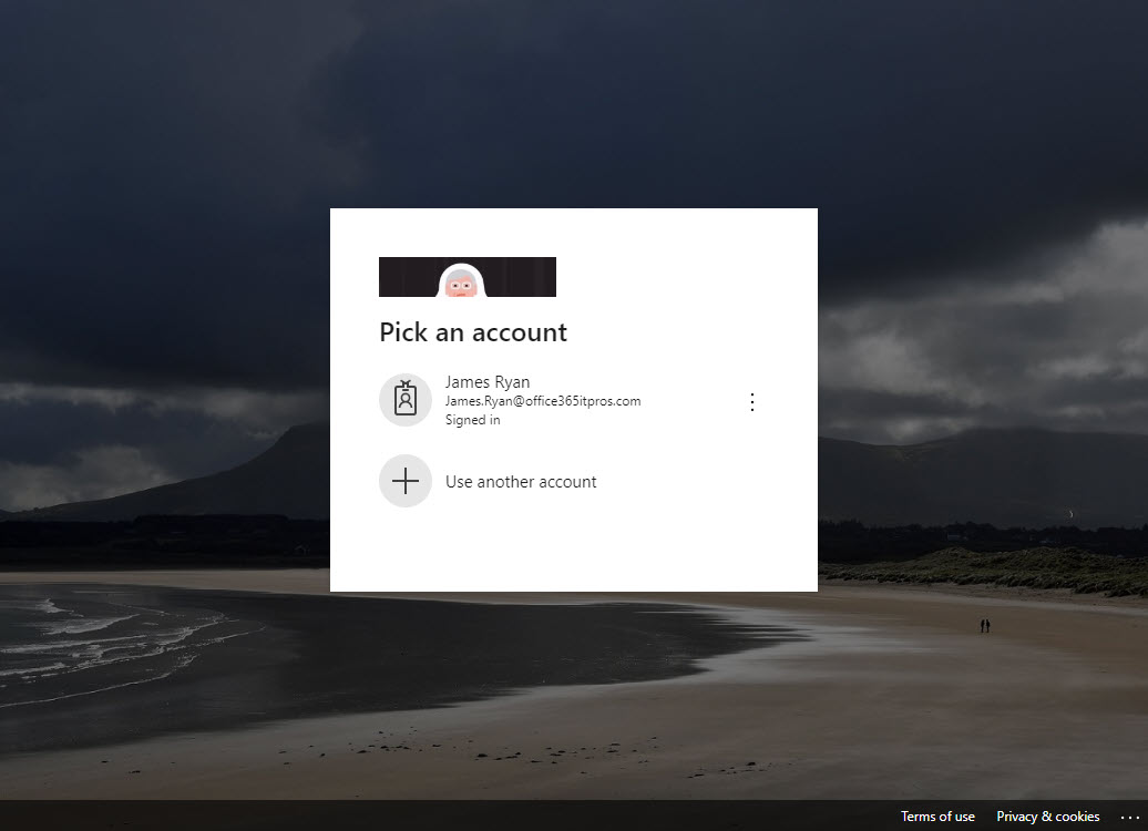
Leave Yammer alone and unused for an hour and it will prompt for credentials (Figure 4). And sometimes, for whatever reason, a second round of prompting happens before Yammer is happy (multiple prompts don’t happen in the old interface). It’s as if Yammer goes to refresh its access token and can’t do it, so it forces the user to sign in (but not enter any credentials). After a while, even if you get the chance to check that your tenant’s branded sign-in screens work, the prompts become irritating, especially because Yammer is an outlier in how it behaves.
It’s a Preview
Previews are intended to give people an insight into functionality that’s coming down the line and give feedback to developers before they commit to general availability. Yammer’s got some work to do to add back features from the old interface. While they’re busy doing that work, maybe they’ll find some cycles to sort out the Files functionality and stop the irritating sign-in prompts.
As to the Fluid Design system, it’s certainly made Yammer a nicer looking application. I wonder what it could do if applied to Teams?